Great Examples of Visualizing Large Numbers 25.May.2012
It just doesn’t add up. We humans have a terrible time understanding large numbers. Once the number starts to exceed what we’re comfortable dealing with, it becomes too abstract and all starts to sound the same. Basically if it is higher than we can count, it’s too big to understand easily. A number of experts have done a great job of explaining why this is, so we won’t go into that here.
Because of our limited comprehension, just hearing the number one billion or ten billion doesn’t do justice to the actual number. What we think of as “just another zero” actually means “ten times the number.” The recent financial crises, with billions of dollars mentioned here and there, has created a wealth of examples. (Some of these are slanted politically, but they are still useful in learning visual storytelling techniques.)
Comparing large numbers to each other:
In this example, shot with extremely low production values, the creator compares two huge numbers by reducing a couple million dollars to a few pennies.
$1 Billion, in $100 bills looks like this:
Simple and concrete. What does $1 trillion look like if it were $100 dollar bills? Just how big is the vault at Fort Knox?
But what will $1 trillion buy you?
Sending everyone in the country on an 11 week vacation doesn’t sound bad to me. Moving beyond a percentage comparison, this example compares a large dollar number to the value of things we are familiar with. This is one of our favorite examples.
Visualizing $4 trillion:
Another comparison piece, but this time by using charts in a visually attractive way and adding animation to show the scale of $4 trillion compared to other large expenditures.
No visuals
All of our examples before now have used visuals, but you can show a sense of scale with out showing anything.
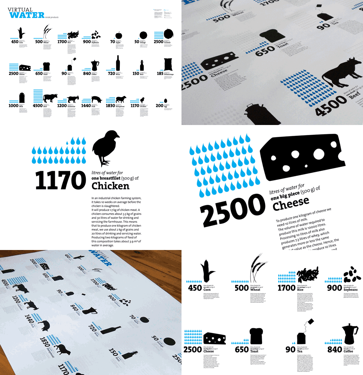
But it’s not all about dollars:

Part of the Virtual Water Project, the premise is to illustrate inefficient uses of water. The unexpectedly large numbers, compared to things as concrete as a piece of cheese, can make a big impact. The simple icons allow quick understanding from a glance.
So how do we do it?
Popular designer Jeffrey Veen gave a great talk at the Web 2.0 conference a few years ago on “Designing for Big Data.”
The Heath Brothers, the guys behind the influential book Made to Stick, have some of their own recommendations for how to make data matter.
What we call this
Visual storytelling is highly effective in communicating hard-to-comprehend information, whether it be big numbers or complex processes.